Web Design
VM-Beratung
Visit website (opens in a new tab)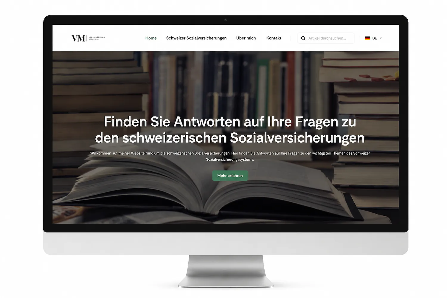
Background
This project marked my first experience with WordPress and the web design process as a whole. I was involved throughout the entire project, from concept and design to technical implementation and the website’s launch.
The idea emerged from my mother’s plan to become self-employed in the field of social work. We wanted to create an information platform covering the Swiss social security system. The goal was to develop a user-friendly website that explains topics such as the state pension system, occupational pensions and other forms of social insurance in clear and accessible language.
The primary target audience is Croatian-speaking people living in Switzerland who are looking for clear information and guidance on the Swiss social security system.
Process
I created the first version of the website mainly with the help of Elementor tutorials and specialist blogs. At the time, I had no knowledge of design principles, typography, modern website structures or the use of dynamic content. My main point of reference was feedback from my mother, who also had no experience in web design.
The requirements were deliberately kept simple. The website needed to present her specialist articles clearly, use green as a central design element and be structured in a way that would allow her to manage the content independently in the future.
Looking back, this project was an important milestone for me. Despite my lack of experience, I succeeded in creating a functional first version of the website. Most importantly, the project sparked my enthusiasm for web design and laid the foundation for my continued development in this field.
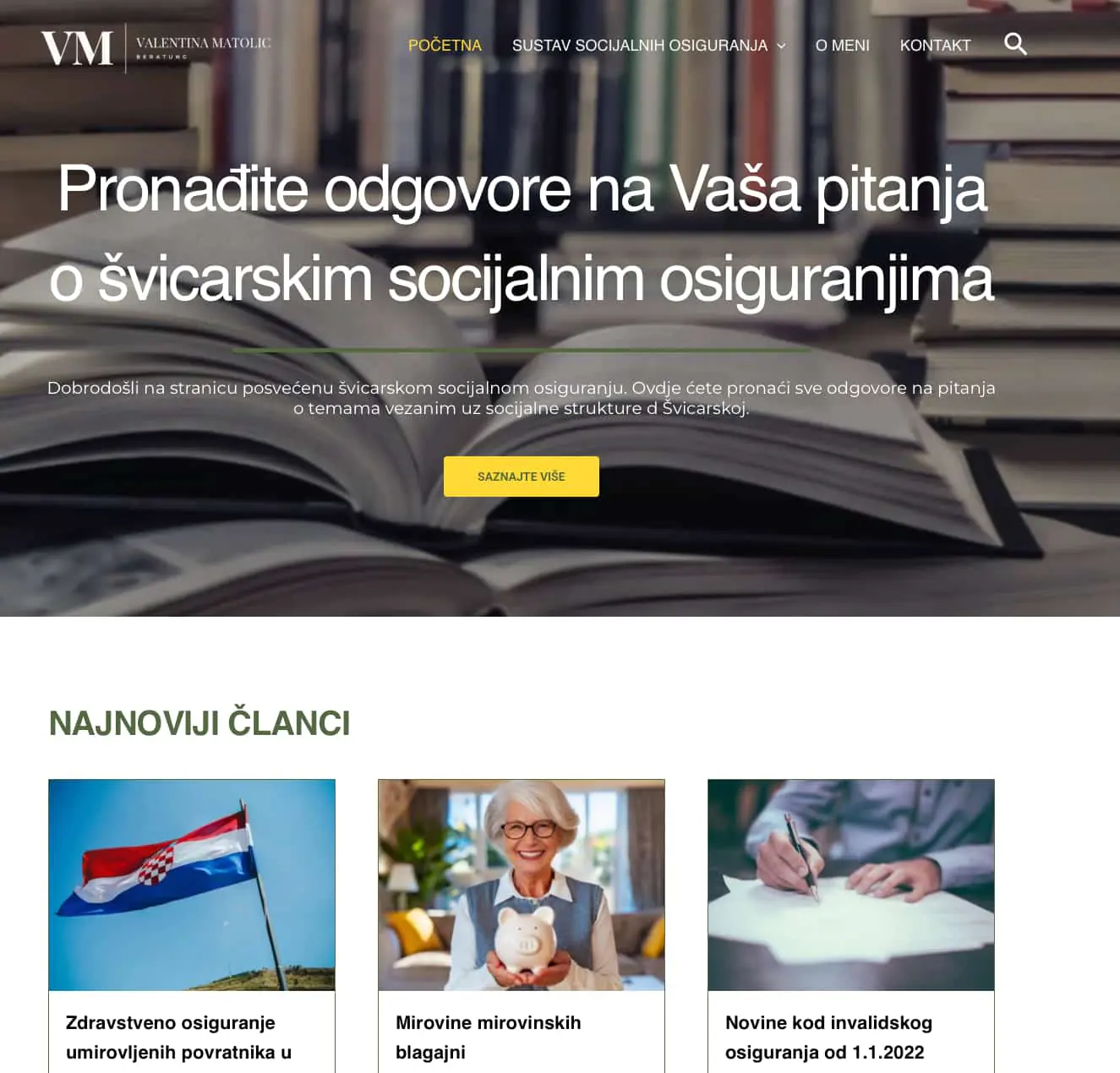
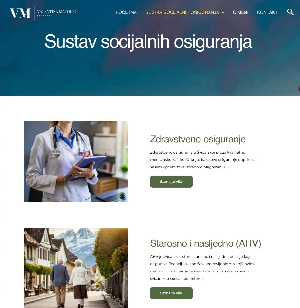
After almost three years and several additional web projects, I revisited the website. It quickly became clear that a redesign was needed. I developed a new colour palette built around a distinctive dark green as the primary colour. For the typography, I chose Rethink Sans for headings and Lato for body copy. The combination gives the website a modern, professional appearance while maintaining excellent readability across its extensive content.
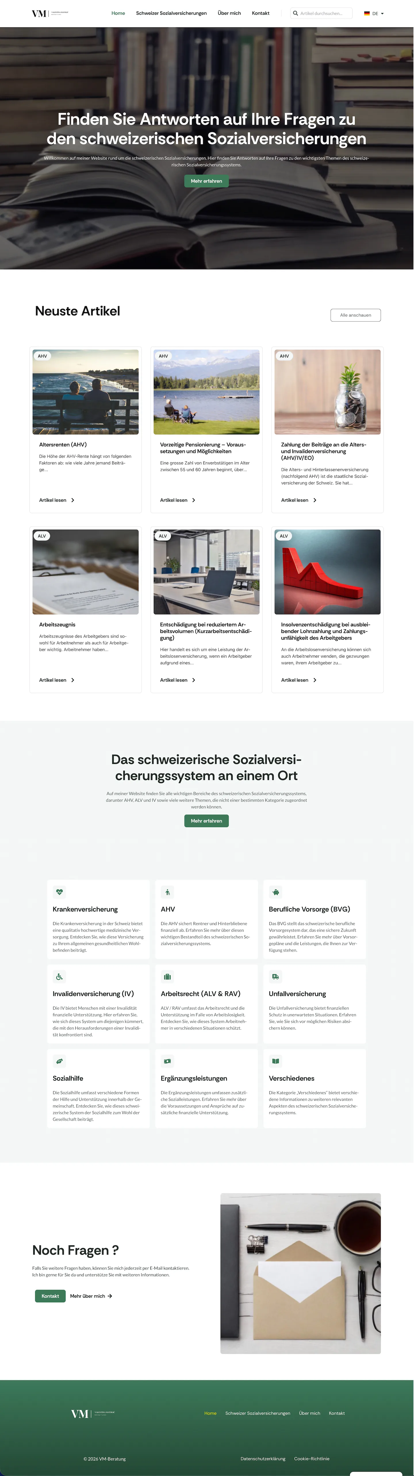
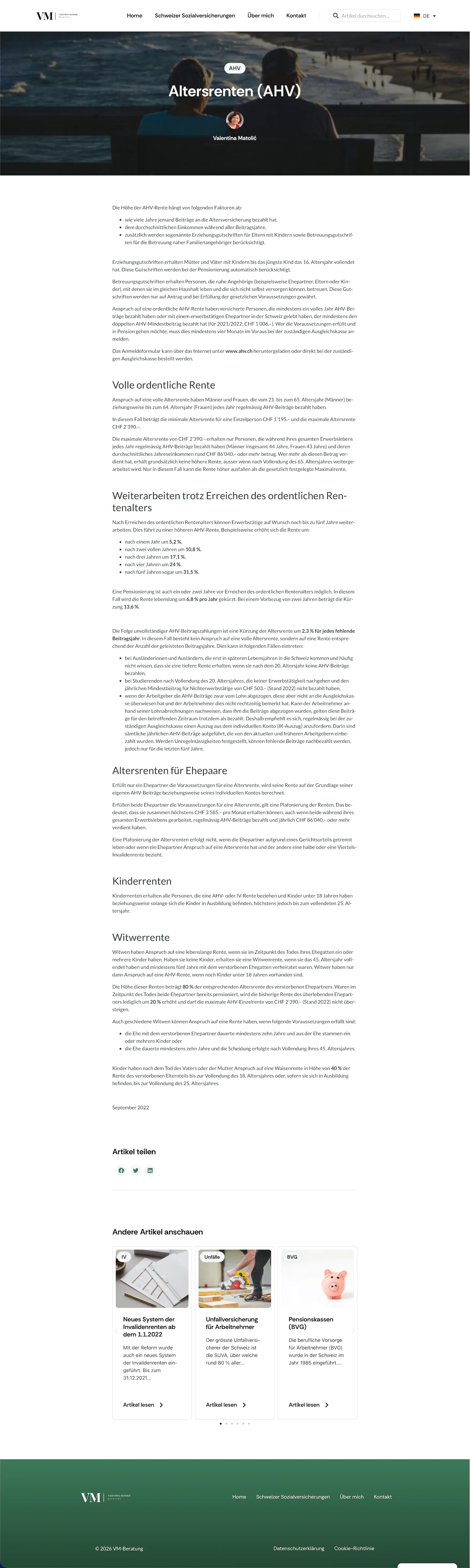
The layout was also thoroughly revised. The current design is significantly cleaner and more minimalist. The blog cards were made more subtle and integrated more harmoniously into the overall visual system. Instead of several separate category archives, I created a central archive page with filtering options, making it much easier to navigate the large number of specialist articles. The most important categories are also introduced on the homepage using modern cards and matching icons.
Another focus of the redesign was making the website bilingual. To reach German-speaking visitors in addition to its Croatian-speaking audience, all content was translated into German and integrated into a bilingual website structure using Polylang.
Outcome